Lumin: Online Learning, From Curious to Enrolled
The part of an online-learning product that decides whether anyone ever reaches a lesson: finding a course, judging it, and signing up. Ten screens held to one rule: nobody needs an account until they've decided to enroll.
- Client
- Lumin (concept product)
- Role
- Product Designer
- Year
- 2026
What I did
- Wrote the design brief: audience, palette, type, screen list
- Mapped the route from visitor to enrolled student (the flow below)
- Ten screens in Figma, including the empty search state
- Reviewed my own screens against the brief (see What I'd change)
- First-pass layouts generated with Figma AI from my brief, then redesigned by hand
- Built the route as a coded prototype in React, with Claude Code, applying those fixes
Most learning-platform case studies start at the lesson player. Lumin starts earlier, at the stretch where people actually leave: a visitor who's curious, scrolling a catalog, deciding whether a course is worth their time and money. The client is invented and the screens haven't been tested with users yet, so there are no outcome numbers here. What there is: a route mapped end to end, the decisions that shape it, and an honest list of what I'd fix.
Key decisions
No account until someone decides to enroll.
Instead of asking visitors to sign up before they can browse.
Onboarding asks one question per step, with Skip for now under Continue.
Instead of a required questionnaire between sign-up and the course.
An empty search keeps the query in view and offers one way back.
Instead of a blank grid with the filters still showing.
The price card carries a second, lower-stakes action: Try a sample lesson.
Instead of a lone Enroll button that sends an unconvinced student off to compare tabs.
Results
- Screens designed
- 10
- Accounts needed to browse courses
- 0
- Onboarding steps, with a skip
- 3
Concept project: Lumin isn't a real client and hasn't been tested with users, so there are no outcome figures here. These numbers describe the design itself, and each one is visible in the screens on this page.
From curious to enrolled
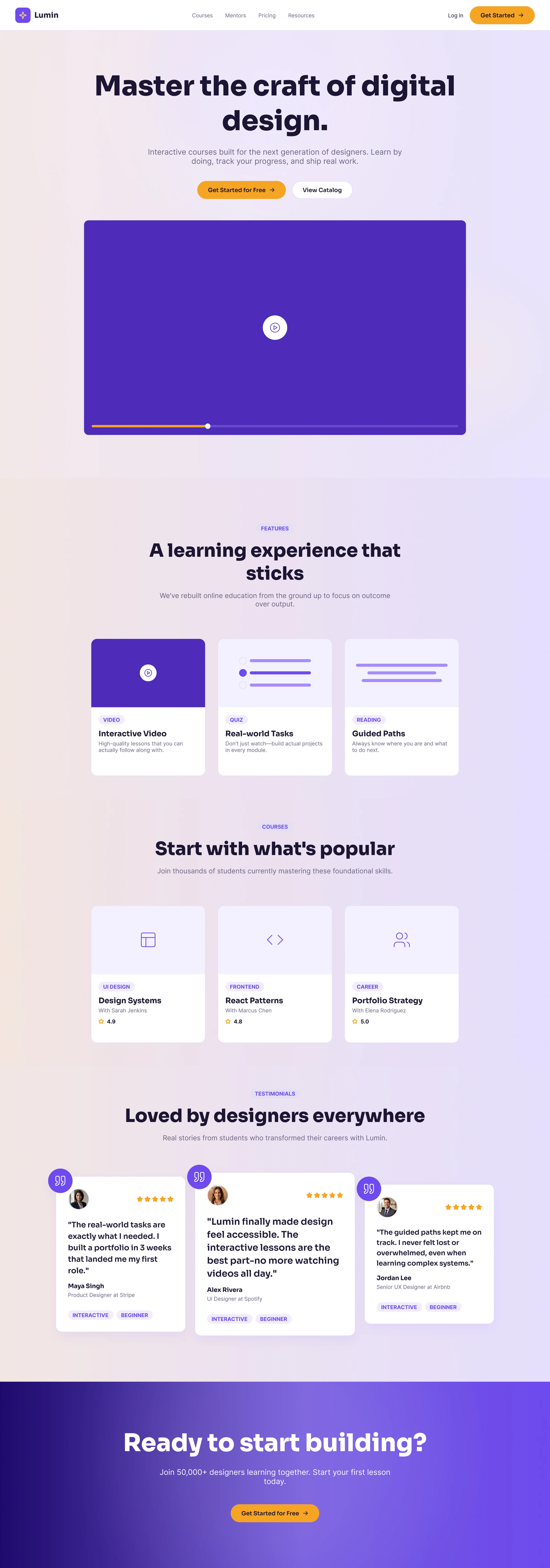
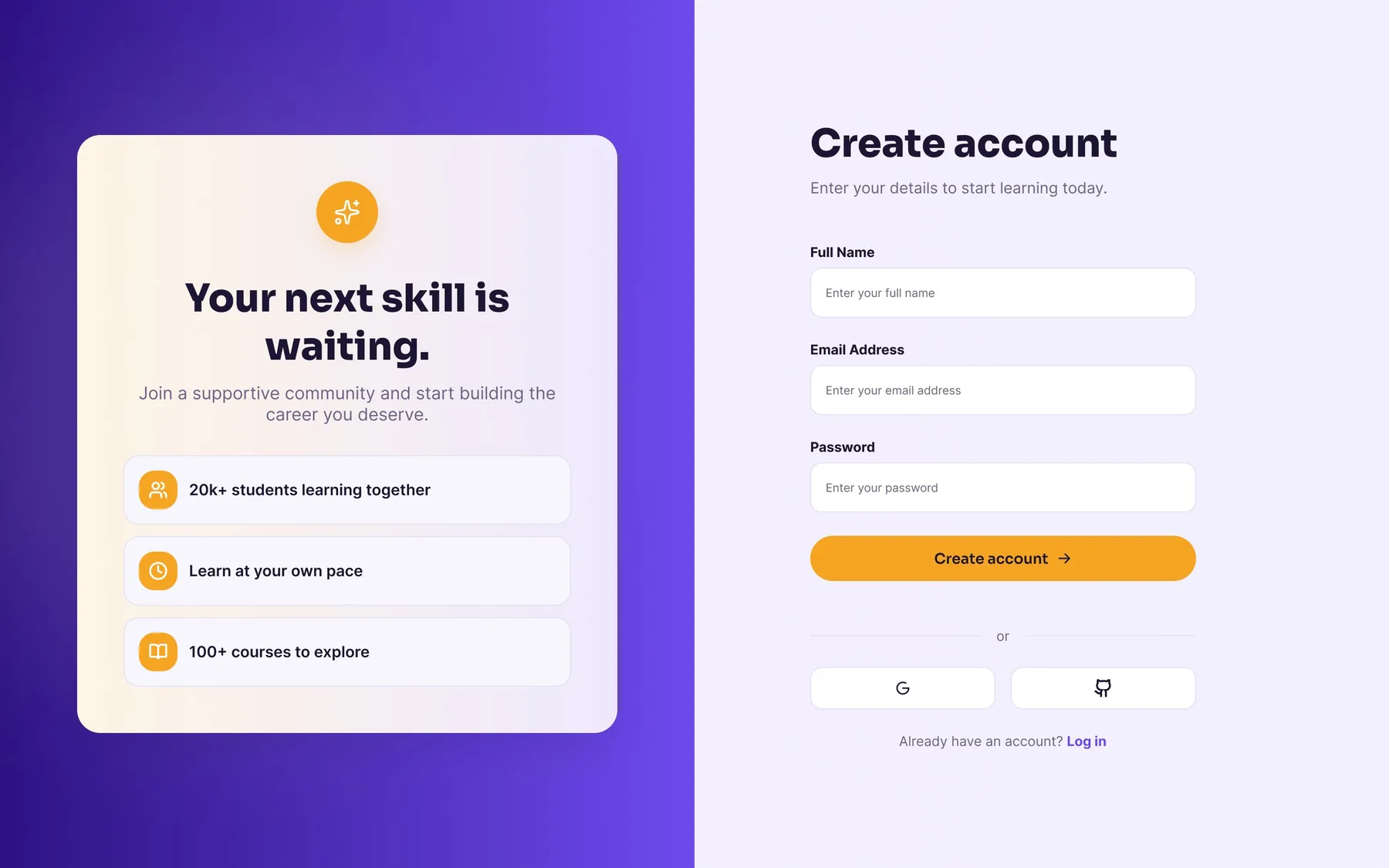
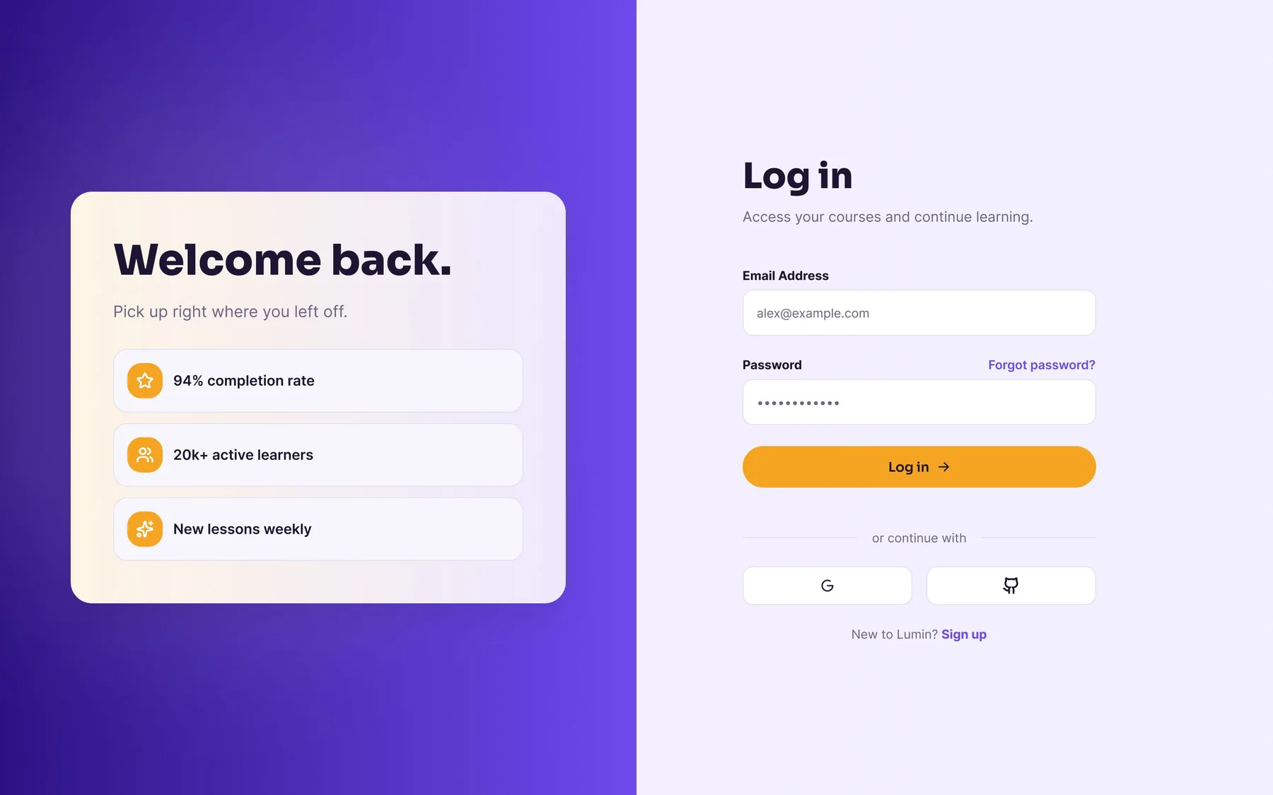
The route runs homepage, catalog, course page, sign-up, onboarding, and the rule I held every screen to is that browsing never asks for anything. The catalog and course pages are logged-out views with Log in and Get started in the header; the account arrives at the moment someone decides to enroll, not before it. Every branch off the main path leads back onto it: a search with no results, a returning user, someone not ready to pay. The last step is drawn dashed because it isn't in this set of screens. Checkout and the lesson player would be the next things to design, and I'd rather show where the work stops than imply it doesn't.
Ask, but don't gate
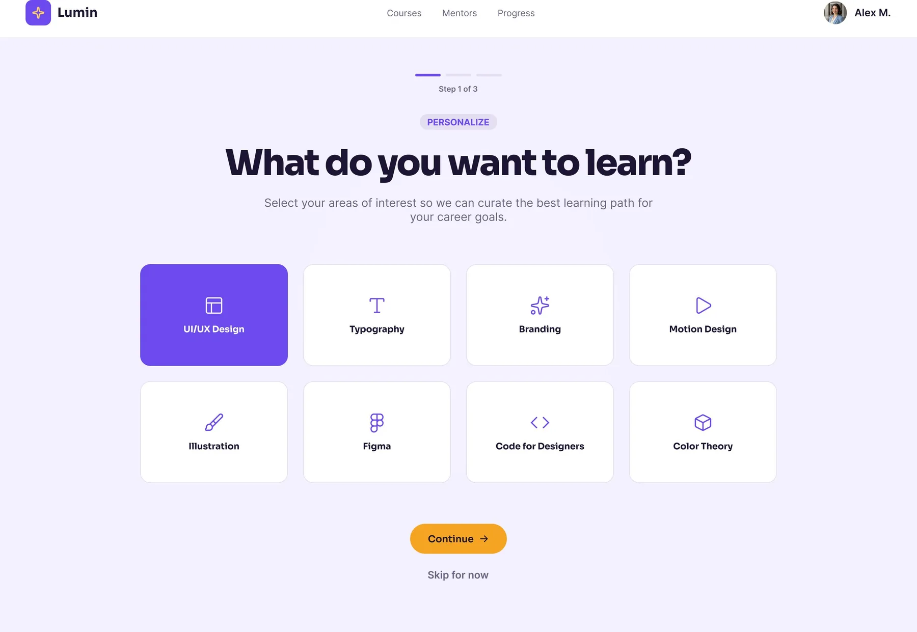
Onboarding asks one question per step: what do you want to learn? Eight interest tiles, one gold Continue, and 'Skip for now' directly underneath it. Personalising the catalog is useful to the product and optional to the student, and a questionnaire wedged between sign-up and the course they came for is exactly where someone who already knows what they want gives up. The three-segment bar at the top states the cost up front: this is step one of three, not one of an unknown number.
No dead ends
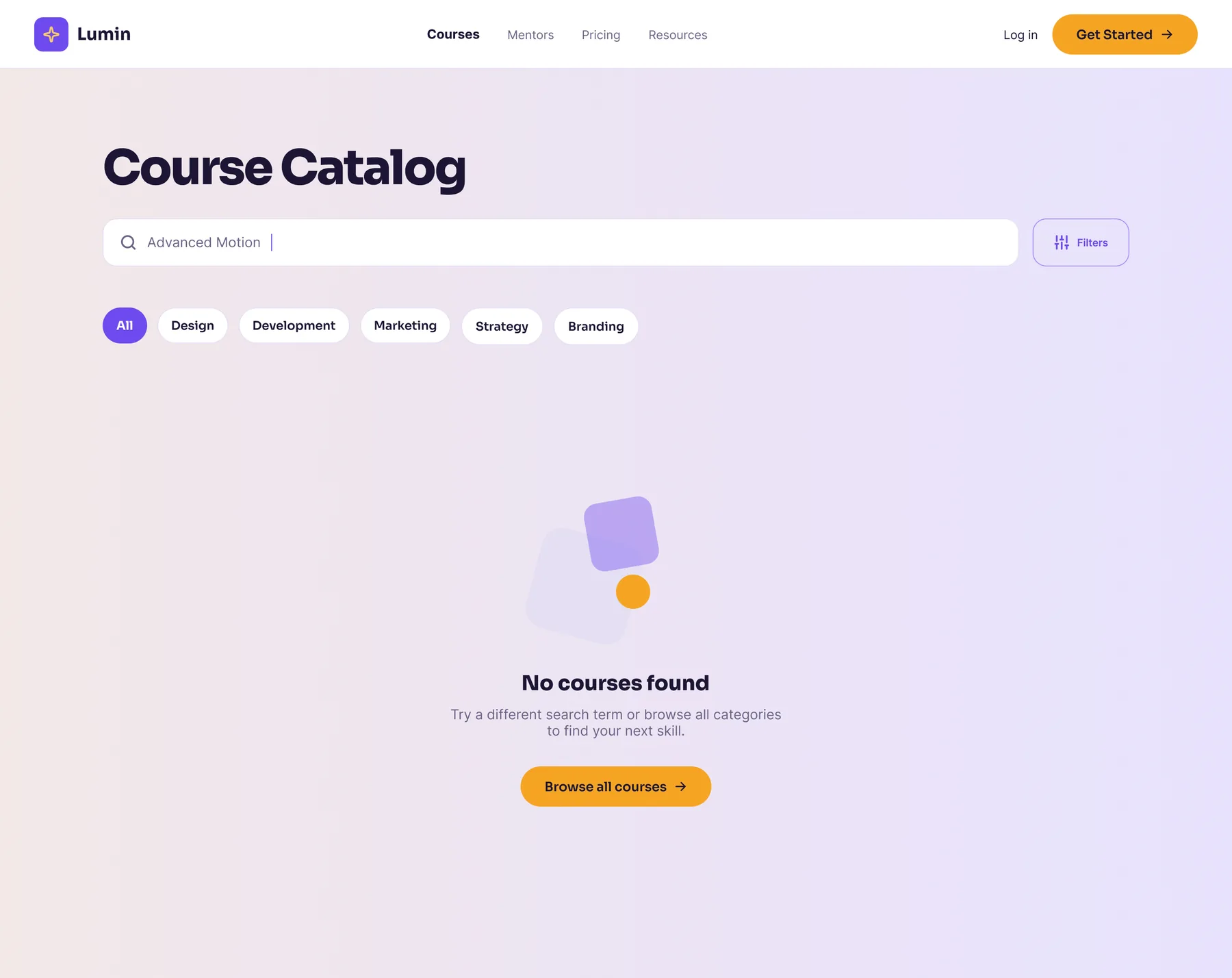
Search takes a topic, a tool or a skill, and category chips narrow it without typing. The interesting screen is the one where that fails. The empty state keeps the query in the box so the student can see what they searched, says plainly that nothing matched, and offers a single way back: 'Browse all courses', in the same gold as the primary action elsewhere. The worst version of this screen is a blank grid with the filters still showing, which is a dead end that looks like a loading bug.
Two ways in
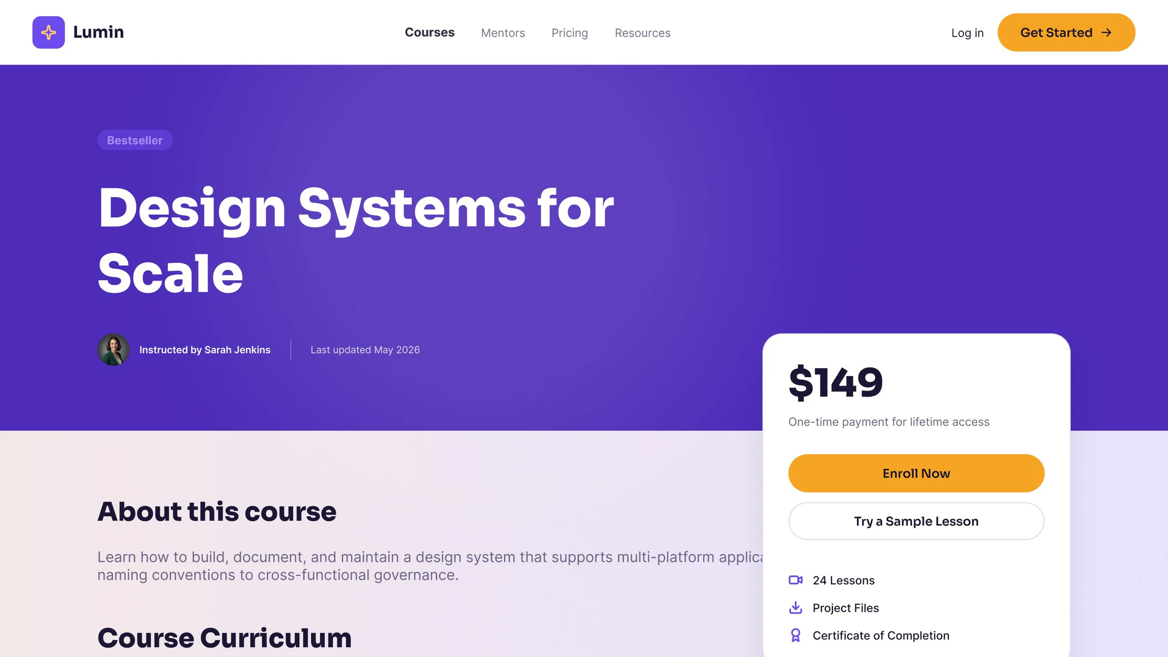
The course page is built around one decision, so the price card stays pinned beside the content as you scroll. It carries two actions on purpose: 'Enroll now' for someone who's convinced, and 'Try a sample lesson' for someone who isn't yet. $149 is a real decision, and an outline button that lowers the stakes keeps that student on the page instead of sending them off to compare tabs. Below the card, the 'what you get' list answers the questions people otherwise go hunting for: how many lessons, whether there are project files, whether there's a certificate.
What I'd change
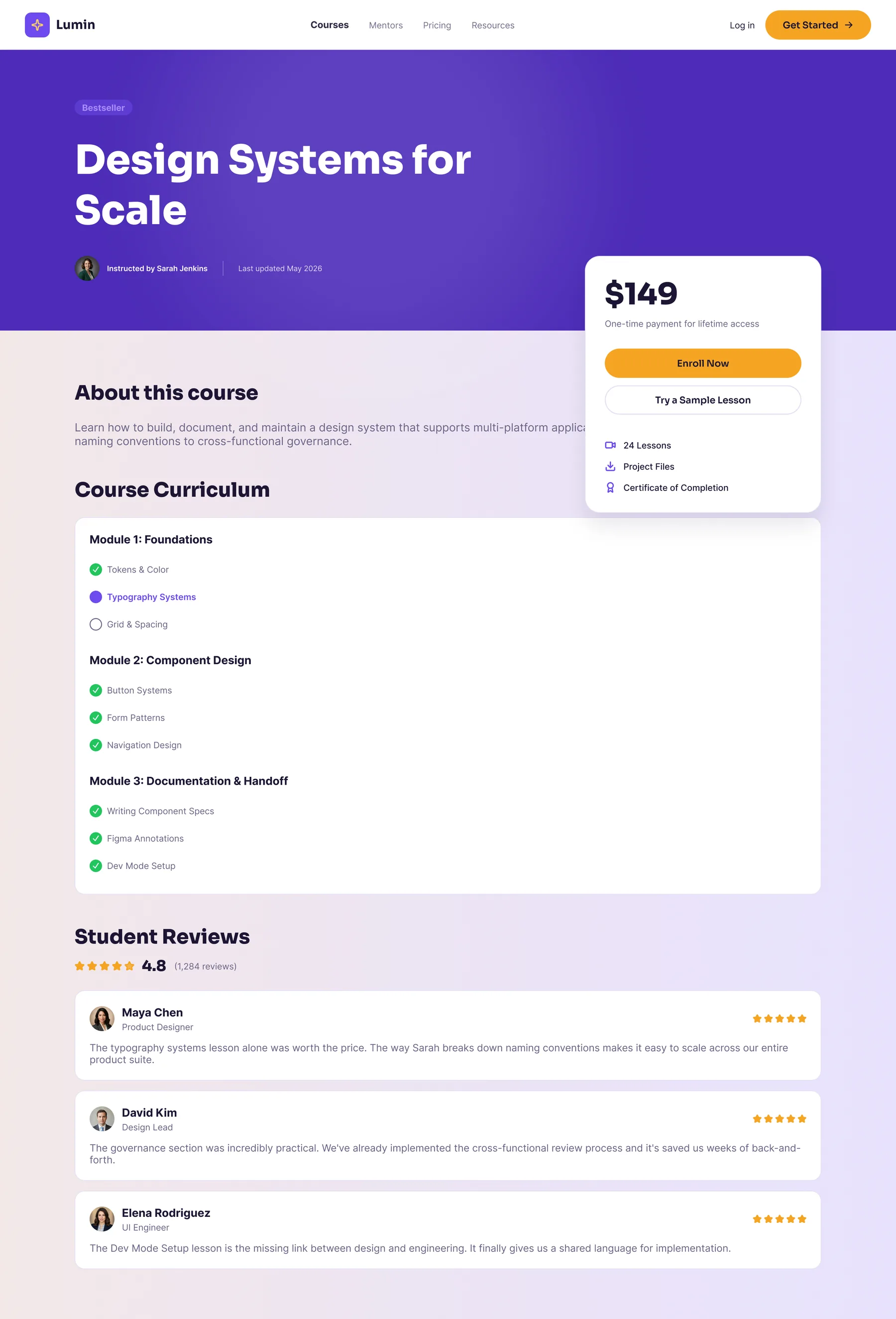
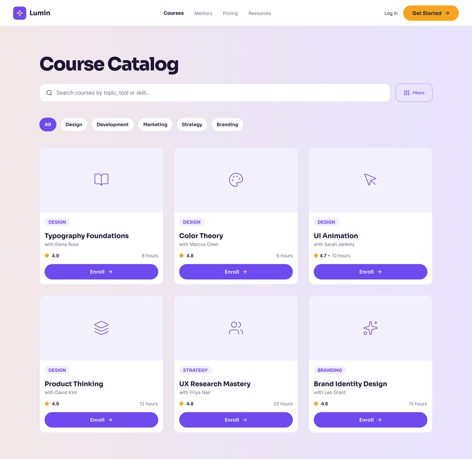
Reviewing the set against my own brief turned up three problems. First, the brief reserves gold for the primary action, and onboarding, the empty state and the course page all follow it, but the catalog's Enroll buttons are violet. That's six loud buttons competing on one screen, and I'd make the whole card the link and drop the button. Second, the course page shows curriculum items ticked as complete next to 'Enroll now', which is progress belonging to someone who hasn't started. Logged out, those should be plain outlines, with progress appearing after enrollment. Third, one catalog card puts its rating and length together where the other five split them, a small sign the card drifted rather than being built as one component, which is the first thing I'd fix in the Figma file. The coded prototype linked at the top applies all three fixes; the Figma screens on this page are the originals. Building it meant adding what the set was missing: onboarding steps two and three, which follow step one's pattern, and a plain end screen where checkout and the lesson player would be. None of it has met a real student yet. The prototype is what the next step tests: a five-person test of this route, starting at the empty search.
Want to talk about this work?
I'm open to UX/UI and product design roles, and happy to walk through any of this in more depth. I'll usually reply within a day or two.
Next project